Your paint
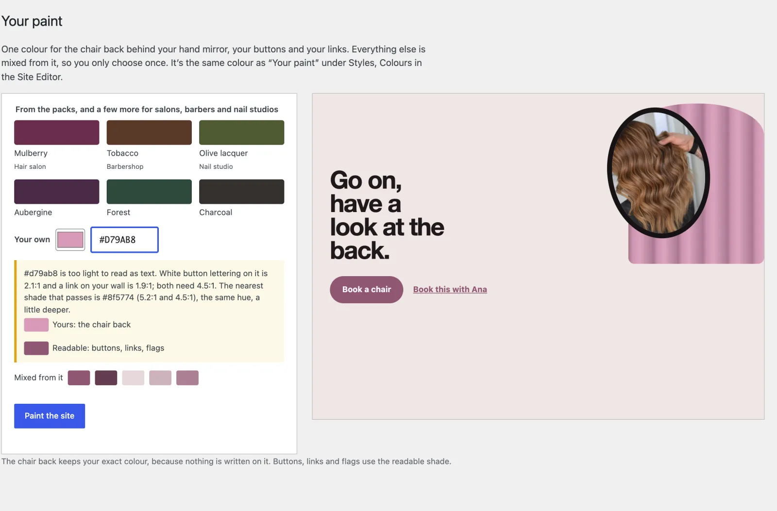
Appearance → Your paint. One colour: the back of the styling chair behind your hand mirror, your buttons, your links, the patch-test flags. Everything else is mixed from it, so you choose once. Choose one of the six offered, or your own with the picker. It is the same setting as Your paint under Appearance → Editor → Styles → Colours.
If your colour is too light to read as text, the screen says so, with the two contrast figures, and shows the nearest shade that reads. The chair back keeps your exact colour, because nothing is written on it; buttons and links use the readable shade. If a light colour arrives some other way (Styles, an import), the site does the same and the dashboard tells you.
Your fonts
Appearance → Editor → Styles → Typography. Choose Mirror (Syne, the default), Barbershop (Oswald headings) or Studio (Familjen Grotesk). Or install any Google font from the Font Library and set it for Headings and Text: every part of the site follows, including the shelf, the prices and booking. Two families is plenty; more slows the site down.
Styles
Appearance → Editor → Styles → Browse styles: Salon (pink plaster, mulberry), Barber (smoke-grey plaster, tobacco), Nail studio (cooler blush, olive). Every text and control pairing in all three has been checked against WCAG AA contrast.
The header
The header stays at the top of the screen as visitors scroll, smaller once they do, so Book a chair is always in reach. Switch it off under Salon → Settings → Header.