On this page
Your red
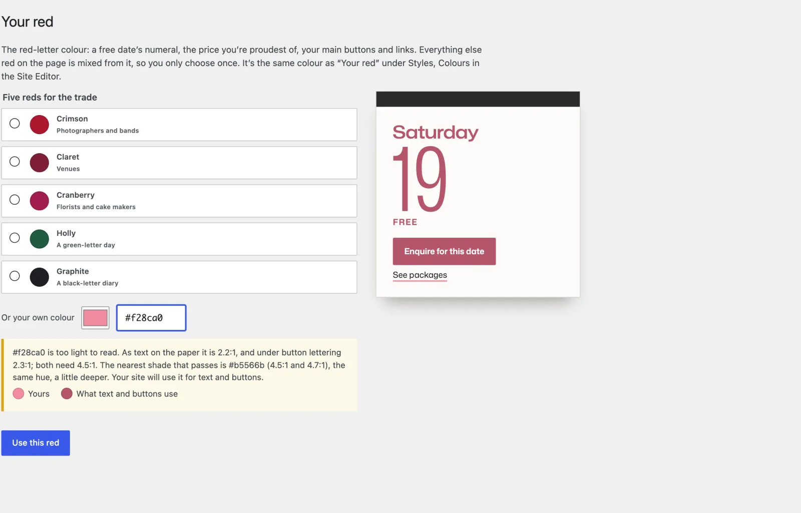
Appearance → Your red. One colour, the red-letter colour: a free date’s numeral, the price you’re proudest of, your main buttons and links, the ribbon in your prices. Everything else red is mixed from it. Five to start from (crimson, claret, cranberry, holly, graphite) or your own.
A colour too light to read is not refused: the screen tells you, and offers the nearest shade that reads, the same hue a little deeper, worked out to 4.5:1 as text on the paper and under button lettering. If a light colour arrives some other way, the site uses that shade for text and buttons and says so on your dashboard. It is the same colour as Your red under Appearance → Editor → Styles → Colours.
Your desk and your type
Appearance → Editor → Styles. Three desks (oak, flax linen and graphite felt) under Browse styles, and three type presets under Typography: Diary (Mona Sans), Almanac (Libre Bodoni numerals and headings) and Planner (Hubot Sans).
Any font you like works too: Styles → Typography → Fonts installs Google fonts on your own site; set them for Headings and Text. The numeral, the weekday and the price follow your heading font and always fit their leaf, wide or narrow. Two families are plenty for speed.
The header
The header stays at the top as the page scrolls, smaller once you scroll, so Check your date is always in reach. Untick Keep the header in reach under Dates → Settings → On the site to let it scroll away.