Ink and type. Card is printed in black and one ink: the line along the edge of every card, the index tabs, the times the booking writes in, and the pale back of the appointment card are all mixed from it. Choose it under Appearance → Ink and type (also in the wizard): your profession’s ink (consultant ochre, therapist lagoon, practice bottle green), plum, black, or Your own with a colour picker. The screen shows a sample as you choose and checks the colour can be read as text on the card and on its pale back (4.5 to 1, the accessibility standard). If it cannot, it says so and offers the nearest darker shade that can; saving a colour that is too light saves that shade instead and tells you.
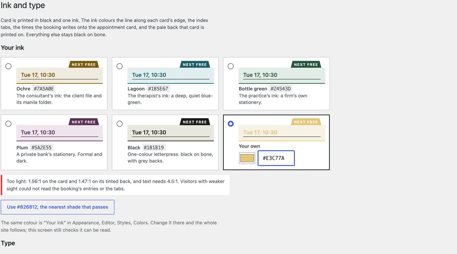
The same colour is Your ink in Appearance → Editor → Styles → Colors, so you can also change it there and the whole site follows. If a colour set there is too light, the site prints with the nearest shade that can be read and the dashboard says so, until you choose another. Style variations Lagoon and Bottle green are the therapist’s and practice’s inks.
Photographs print in black and white, like the rest of a letterpress card. To show one of your own in colour, select it and choose the In colour style. (The starter photographs are saved in black and white, to keep the pages light, so they stay grey either way.)
Type. The design sets your card in Anybody (its wide capitals are the engraver’s line on a business card) and everything you read in Source Serif
- Ink and type offers three more presets, each of two families: Clarendon (Besley on the card, Atkinson Hyperlegible Next for reading, drawn for people with low vision), Grotesk (Schibsted Grotesk with Literata) and One serif (Source Serif 4 throughout). They are also under Styles → Typography.
For any other font, go to Appearance → Editor → Styles → Typography. Under Fonts, the + (Add fonts) button opens the Font Library: choose Install fonts, allow it to connect to Google Fonts, pick a font and its weights, and Install. WordPress copies the files to your own site, so your visitors’ browsers never contact Google. Then choose it for:
- Headings: the card (your name, your firm, its foot), the index tabs, buttons, the menu and small headings;
- Text: everything you read, and the large headlines, which Card sets in the reading face like a printed card.
The whole site follows, including the booking and the calling card (a wide font is fitted to the card), and the editor shows it before you save. One font for each is plenty; every extra font makes the first page load a little slower.